
Issue
I know how to make Material Design button with color fill:
style="@style/Widget.AppCompat.Button.Colored"
And no-bordered transparent button:
style="@style/Widget.AppCompat.Button.Borderless.Colored"
However, is there a way to make Material design bordered (transparent inside) button? Something like below?

Solution
You can also use the Material Components for Android.
Add the dependency to your build.gradle:
dependencies { implementation 'com.google.android.material:material:1.3.0' }
In this case you can use the MaterialButton in your layout file:
<com.google.android.material.button.MaterialButton
   ....
   style="@style/Widget.MaterialComponents.Button.OutlinedButton"
   app:cornerRadius=".."
   app:strokeColor="@color/colorPrimary"/>
Apply the style @style/Widget.MaterialComponents.Button.OutlinedButton.
In your case use the app:cornerRadius attribute to change the size of corner radius. This will round off the corners with specified dimensions.
Use te attribute app:strokeColor and app:strokeWidth to change the color and the width of the border.
You can also customize the corners using ShapeApperance (it requires version 1.1.0)
<style name="MyButton" parent="Widget.MaterialComponents.Button.OutlinedButton">
    <item name="shapeAppearanceOverlay">@style/MyShapeAppearance</item>
</style>
<style name="MyShapeAppearance" parent="">
    <item name="cornerFamilyTopLeft">rounded</item>
    <item name="cornerFamilyBottomLeft">rounded</item>
    <item name="cornerFamilyTopRight">cut</item>
    <item name="cornerFamilyBottomRight">cut</item>
    <item name="cornerSize">8dp</item>
</style>
The official doc is here and all the android specs here.
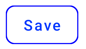
With jetpack compose 1.0.x you can use the OutlinedButton and the border attribute:
    OutlinedButton(
        onClick = { },
        border = BorderStroke(1.dp, Color.Blue),
        shape = RoundedCornerShape(8.dp)
    ) {
        Text(text = "Save")
    }
OLD (support library)
With the new Support Library 28.0.0, the Design Library now contains the Material Button.
You can add this button to our layout file with:
<android.support.design.button.MaterialButton
    android:layout_width="wrap_content"
    android:layout_height="wrap_content"
    android:text="XXXX"
    android:textSize="18sp"
    app:icon="@drawable/ic_android_white_24dp" />
You can customize the button with these attributes:
app:backgroundTint: Used to apply a tint to the background of the button. If you wish to change the background color of the button, use this attribute instead of background.app:strokeColor: The color to be used for the button strokeapp:strokeWidth: The width to be used for the button stroke
Also
Answered By - Gabriele Mariotti


0 comments:
Post a Comment
Note: Only a member of this blog may post a comment.